
青年是世界发展的未来,而上海合作组织地区的18个国家共居住超过十亿青年。SCOLAR Network团结了来自上合组织地区各地的青年领袖和学者,通过文化、教育、创业为青年群体提供更广泛的发展平台。我们的愿景是在2050年正面影响十亿青年的生活!
今年9月15日,上海合作组织成员国元首峰会在乌兹别克斯坦撒马尔罕举行,正式欢迎新的国家(埃及、卡塔尔和沙特阿拉伯)加入上合大家庭。 “上海精神”即“互信、互利、平等、协商、尊重多样文明、谋求共同发展”是上海合作组织以及上合地区的灵魂,体现了包容团结的精神。
当我们地区面临挑战时,团结一致尤其重要!现在,巴基斯坦正遭受一场前所未有的自然灾害。巴基斯坦三分之一的地区遭受洪水影响,洪水造成上千人死亡,其中包括400名儿童,3000万人流离失所。洪水淹没了数百万英亩的庄稼,数十万头牲畜被席卷而走,引发食物紧缺。
SCOLAR举办第一届“Unity” T恤设计大赛,为充满想象力的青年们提供一个大展身手的平台。
SCOLAR邀请大家投票选出最好的“UNITY”T恤设计!7位选手与12件设计作品进入决赛!请大家查看下面的设计及其描述,点击投票选出你最喜欢的设计!
公众投票:2022.11.23——2022.11.30(24:00前)
结果公示:2022.12.3
Designs with descriptions
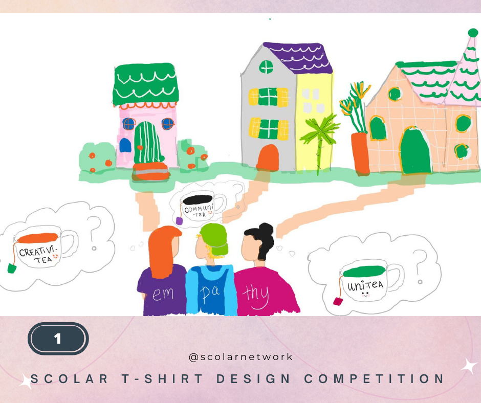
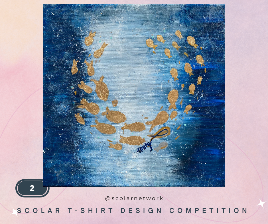
Emilia Bekshentayeva, 5 Kazakhstan (1,2)
The picture depicts a small community where residents enjoy their “tea” time together. Amongst the tea choices are creativitea, unitea, communitea. Despite their differences, they unite, delightfully share their experiences, and practice empathy and understanding.
The acrylic painting description shows the school of fish (illustrated using golden leaves/gilt). They symbolize unity and community. While lone fish won’t be able to survive the world’s challenges, they overcome various obstacles and solve everyday tasks.
Emelie drew with the help of my Mom, Kamila.
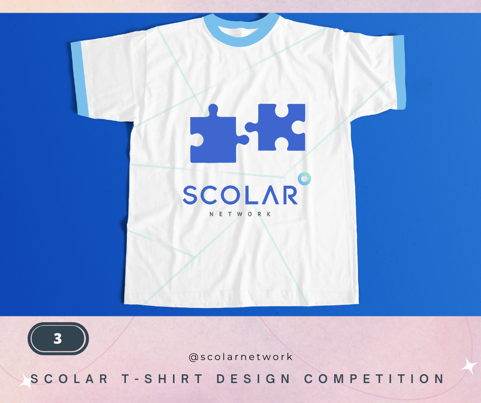
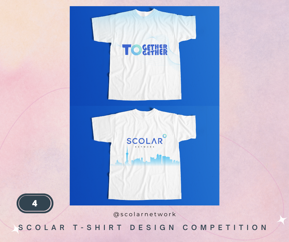
Angirash Karki, 26 Nepal (3,4)
The line and the faded gradients in the middle represent the connection between communities despite the distance. The puzzle in the middle represents connection despite differences. And the color of the neck and hand rib in sky blue represents a close SCOLAR Family.
Front: The line represents connection, freedom, and the free flow of ideas.
The letter in the font says Together twice, where T is single, and O is the logo of SCOLAR.
The “T” and “O” represent SCOLAR Network, and “gether” is written twice because it means all the people it will connect with.
So it’s like saying Scolar Network “TO”the communities.
Back: There is a city skyline, which can be changed according to the different hubs in different countries.
Thus it will be easier to recognize the hub member in future conventions.
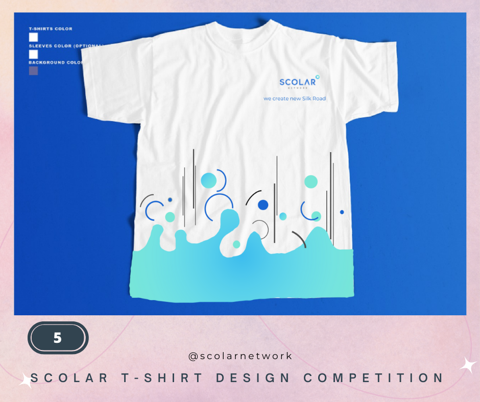
Franklin Zhu, 40, China (5)
我用大海里的海浪来表现SCOLAR Network 里各国优秀人才和优秀创业家的多样性。每个人都像一朵浪花,有大有小,但是都互相滋养着彼此,来表现SCOLAR Network 这个组织的包容力很强
I use the ocean waves to express the diversity of talented people and entrepreneurs in the SCOLAR Network. Everyone is like a wave, big and small, but they all nourish each other, showing the SCOLAR Network’s strong tolerance.
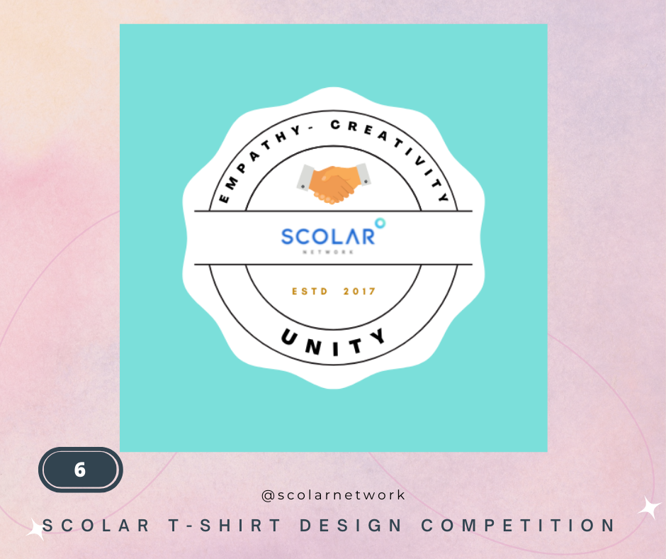
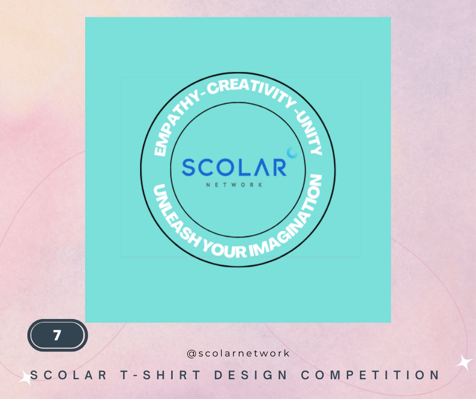
Soomal Qureshi, Pakistan (6,7)
The designed shirt logo depicts the unity of scolar with its hubs to strengthen connectivity and promote empathy and creativity.
Muhammad Zubair, Pakistan (8)
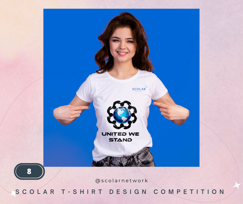
My design hides many meanings in each of its segments. When you look at the outer “round black shape,” you will realize this simple but unique design caring depth of SCO itself as it seems like 8 SCO heads of state holding their “hands together,” showing unity and empathy while simultaneously they are overseeing the “Globe” which represents the “Growing Global Community” also It is an “eight petals flower” which mean “Brotherhood, Love and respect” for each other.
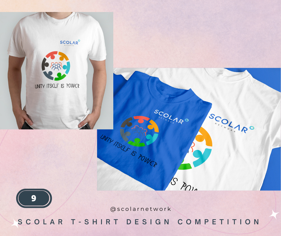
Fatima Muhammad Irfan, Pakistan (9)
Unity itself is power; it is to make everybody feel welcome, stand united through good and hardships, and achieve a combined goal.
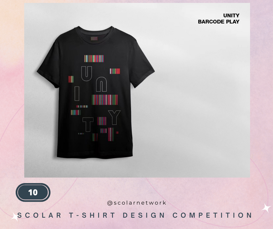
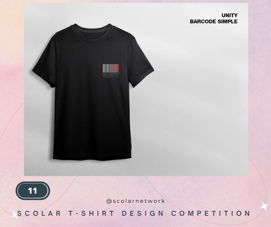
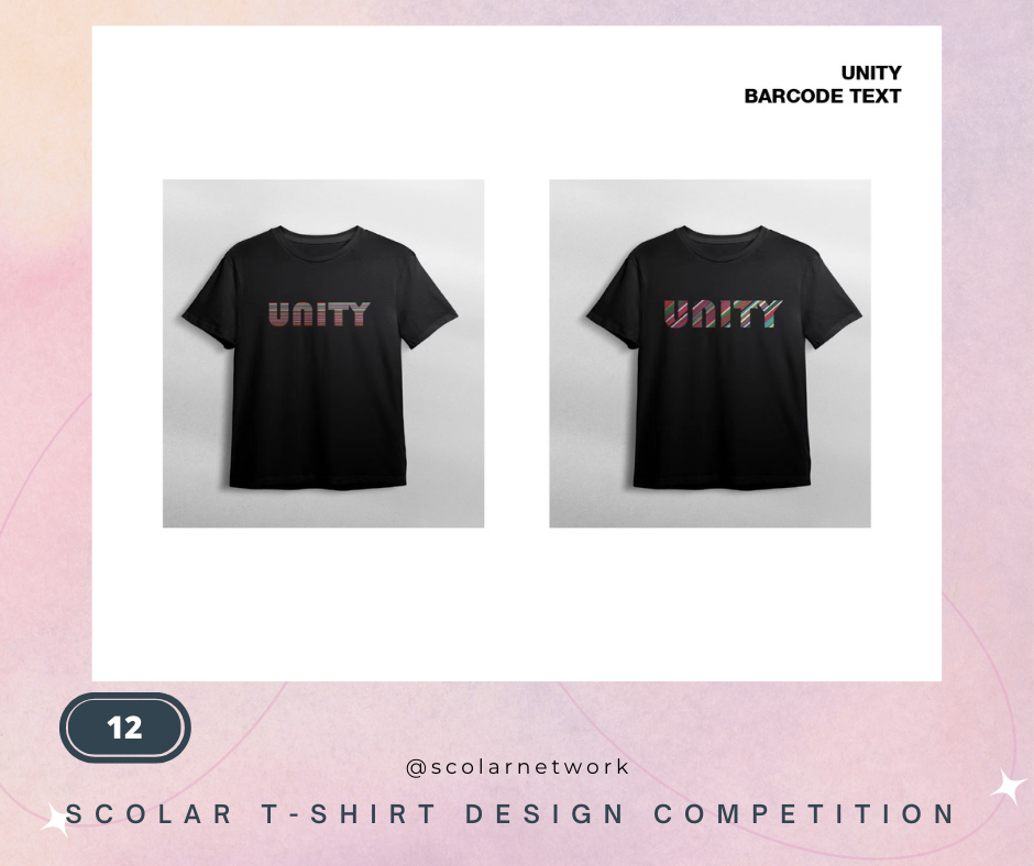
Kseniya Otmakhova, Russia (10, 11, 12)
INSPIRATION
In 2001, European functionaries commissioned Dutch architect Rem Koolhaas, the designer behind Beijing’s iconic CBD, to create a new logo for the EU. The barcode elongates and merges the flags of current EU member states into a single colorful symbol. It intends to represent the essence of the European project, showing Europe as the common effort of different nation-states. Each state retains its cultural identity while sharing the advantages of acting together.
VOTE FOR THE BEST “UNITY” T-SHIRT DESIGNS
CLICK THE DESIGN YOU LIKED AND VOTE!!
【评优规则】
比赛将采取 公众评审(60%)与 组委评审(40%)相结合的评优模式
其中公众评审将以投票形式进行